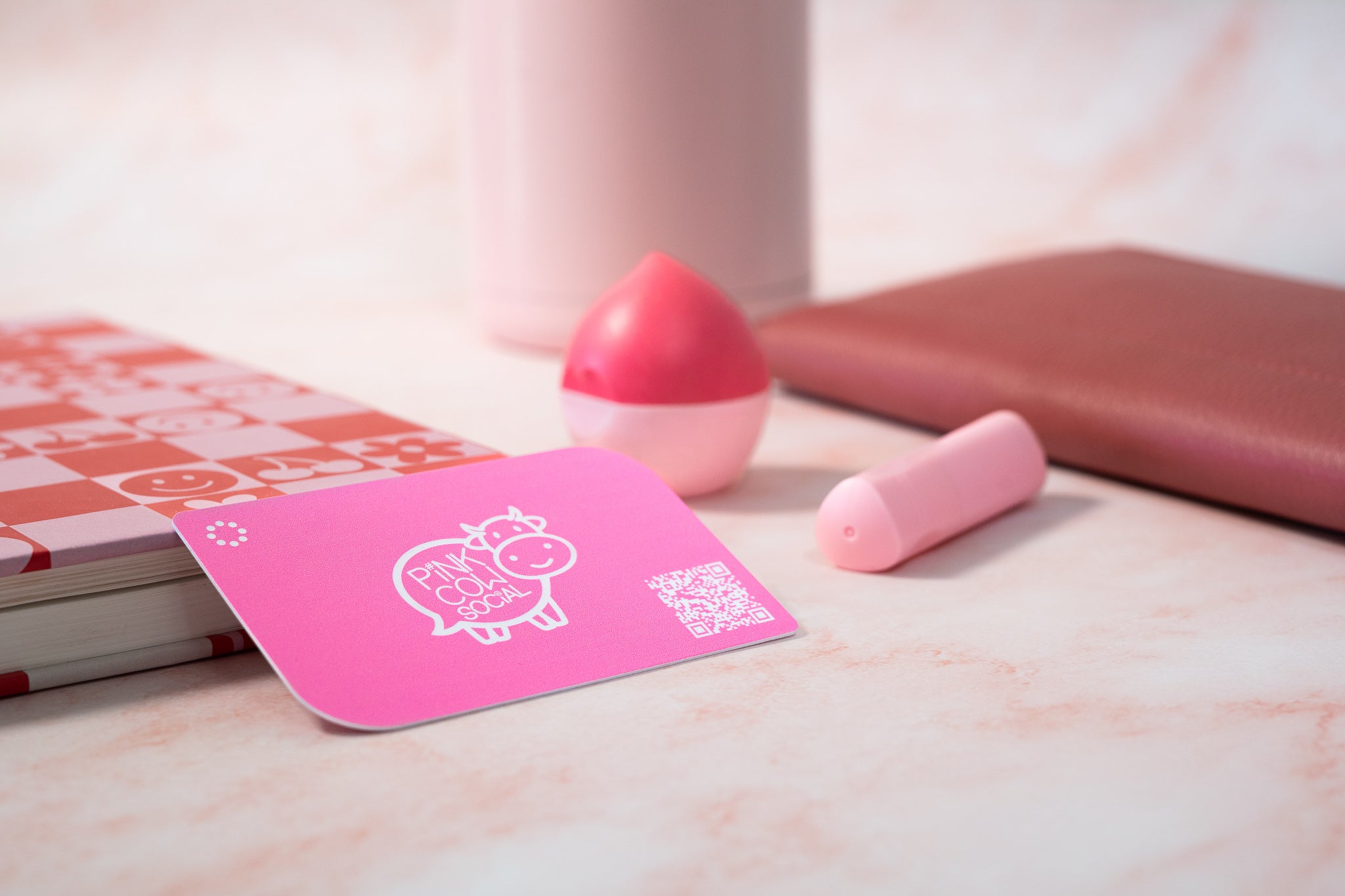
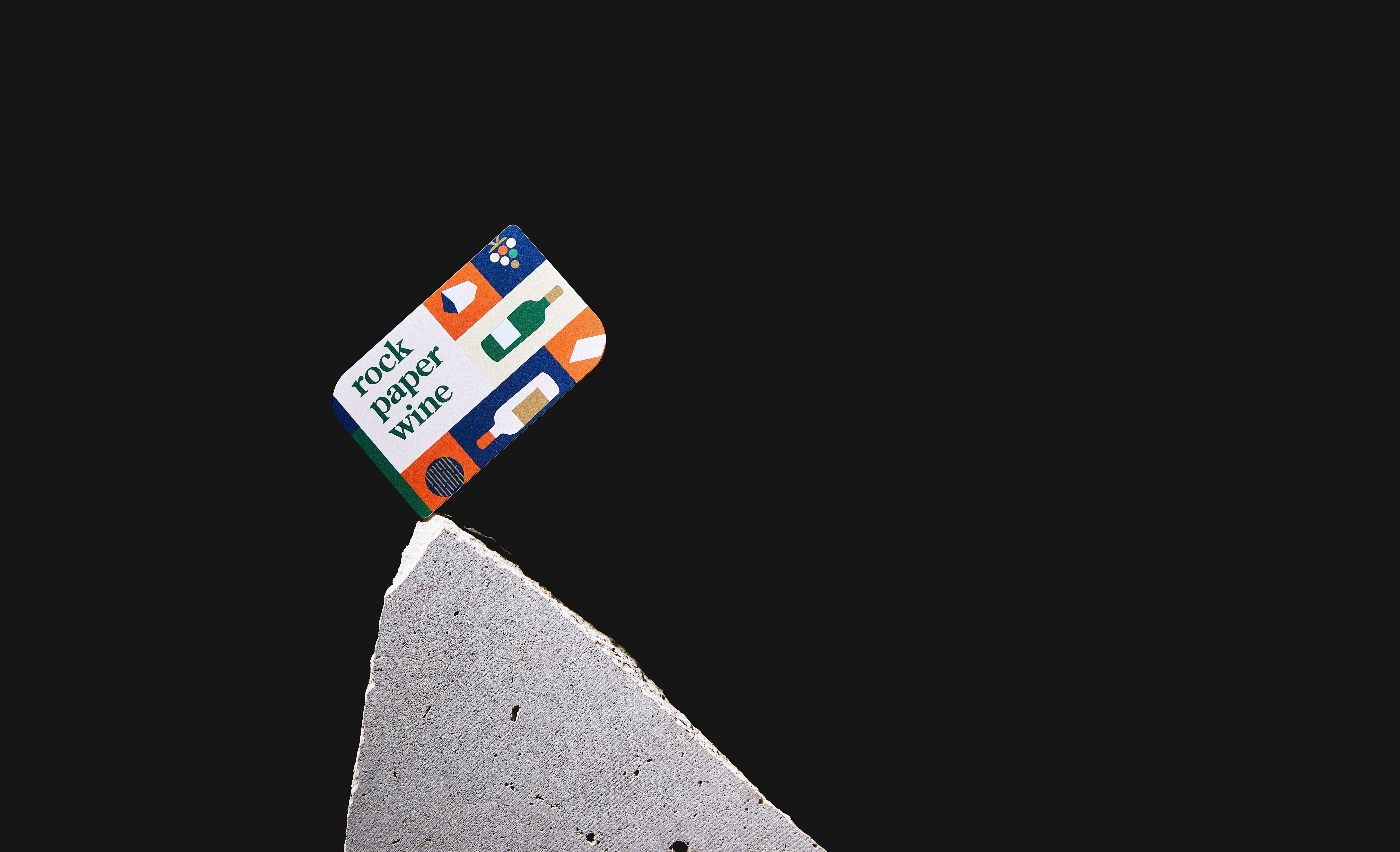
It’s 2022, and we’ve entered a new era for marketing your business. That includes revamping the humble business card, and creating a solid digital profile to match. Let’s first consider the back of your card; a place that you might’ve previously left blank, or haven’t yet made the most of. Just like a billboard on a busy highway, the back of your business card is prime real estate, and shouldn’t be neglected.
Forget going back to basics––it’s time to get creative on our backs.
1. First impressions count.
You’ve got one shot (one opportunity) to impress the person you’re handing your card to. Don’t let it slip. The back side of your business card should be well utilised to promote yourself and what you’re selling without looking too busy. Think: a strong tagline with a unique design, and an engaging CTA that directs people to your website. Everything that exists on there should be purposeful, instead of being thrown in for the sake of peacocking. Leave that one to the Birds.
2. Establish your tone of voice.
Keep it simple, yet you. The best creative copy is short, punchy, and gives people clear insight into what you’re selling. It can also be fun, witty, and unexpected––but you want to ensure it shares your business values. For example, if you’re a tradesman, clever copy can be used to highlight your punctuality when it comes to responding to house calls. Something as simple as: “I’ll be there in a flash” can give prospects a keen understanding of how you operate. Bottom line is, you don’t need to be wordsmith to write a creative tagline—you just need to express your mission statement.
3. Make it eye-catching, but don’t go overboard.
A study conducted by Adobe in 2018 found that 95% of the World’s Top 100 Brands used only one or two colours in their marketing designs. Why? Because consistency is key, and a chaotic colour palette is a Picasso, not a business card. It’s a good idea to introduce colour to the back of your card while also leaving some white space. This helps draw your reader to the most important information or image. In search of a sleek logo? Luckily, with Tapt’s handy customisable design feature, designing the back of your business cards has never been more seamless, or fun. For more design tips, head here.
4. Add a little more value.
Sometimes people need a little reward or incentive to hold onto your card, and remember to refer back to it later. Try adding a discount code (like 10% off their first order) onto the back to encourage website traffic and sales. Or, why not offer them a freebie for their 10th purchase? It’s a small price to pay for a big return.
5. QR codes for the win.
It’s not shocking that QR codes have become popular among business owners––even our mums are using them. If you’ve got an introductory video or a visual how-to that helps explain your product, a QR code is an effective tool you can use to provide a potential client with more information. And what better place to feature it than the back of your business card? A picture may say a thousand words, but a QR code that links to your brand video can help sell your product with the positioning of an iPhone camera.
6. Plug your socials while you’re at it.
For some, social media is a crucial part of their business’ marketing strategy. That’s not surprising, considering Instagram alone has over 1 billion monthly users. Whether you’re on one platform or all of them, directing people to your social accounts gives them a more complete picture of who you are, what you do, and why they should come to you.
7. Location, location, location.
A map is something that’s both visually appealing and practical. Adding one to the back of your business card can be a great tool for local businesses as it helps people find you, and encourages them to stop by. Or, you can use your Tapt digital business card to send your business’ address directly to their phone. All it takes is one swift tap.
8. Introduce testimonials.
Even in this digital age, word of mouth has stood the test of time as an effective strategy to market your business. So, if you’ve got a blank space on the back of your card, consider flaunting a glowing review (or two). It’s a great way to establish trust, and pique people’s interest in your product or service.
Need a little more inspiration? Flick through our custom lookbook to see how other brands have designed their business cards with Tapt.
Now, let’s get creating.


Blundstone x Tapt: Australian brands coming together
NFC vs. QR Codes: The Superiority of NFC Business Cards in Digital Networking